Artist portfolio and gallery system
The site needed to feel deliberate and restrained: enough structure for discovery, enough space for the artwork, and enough copy to explain the psychological layer behind the pieces.
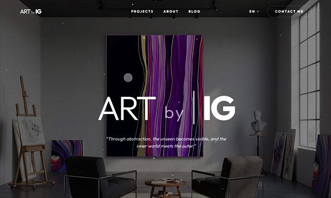
A portfolio surface that behaves like a gallery wall, not a template. Visitors can read, scan, and move through the work without the interface competing for attention.
- Primary mode
- Gallery
- Tone
- Editorial
- Focus
- Artwork
- Visual direction
- Responsive design
- Content structure
- Portfolio UX
Artwork first
The page hierarchy gives the art priority. Supporting text is placed where it helps interpretation, not where it distracts from the visual work.
- 01Large artwork moments
- 02Calm visual rhythm
- 03Readable story blocks
Meaning without over-explaining
The copy translates the artist's conceptual position into clear language, connecting visual expression with perception, emotion, and subconscious response.
- 01Artist narrative
- 02Collection context
- 03Visitor-friendly language

Need a useful product surface like this?
Bring the workflow, the audience, and the constraints. I will help turn it into a shipped web app, site, AI tool, or case file worth showing.